


The problem
ChapStick became shorthand for the category; an extraordinary asset, and an easy one to mistake for relevance. Recognition kept the brand familiar without keeping it distinctive. As newer players arrived with sharper visual worlds and stronger points of view, the job was to turn decades of recognition back into something active: a brand people did not just know, but noticed again.
The position we took
When your name already lives in people’s language, the job is not louder branding. It is giving that familiarity a world, a voice and a system only ChapStick can own, then making it hold everywhere.
What we made
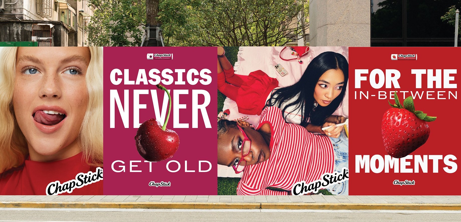
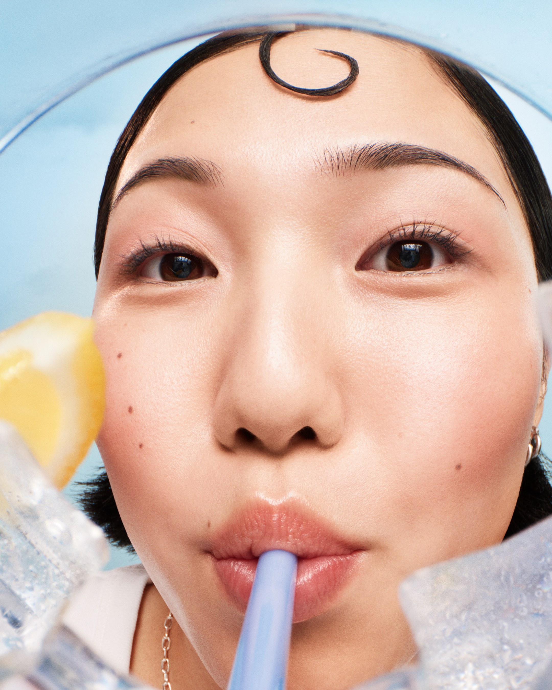
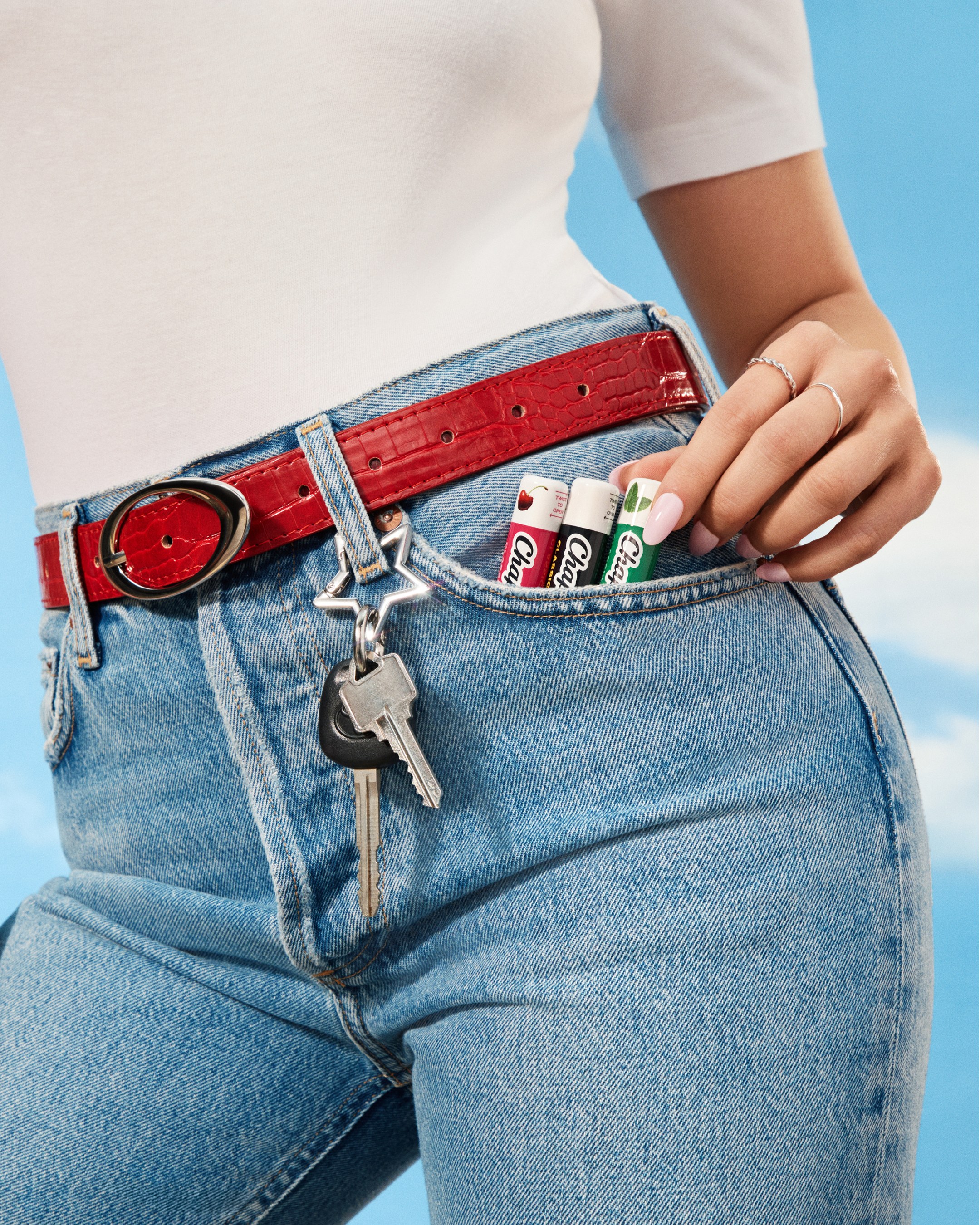
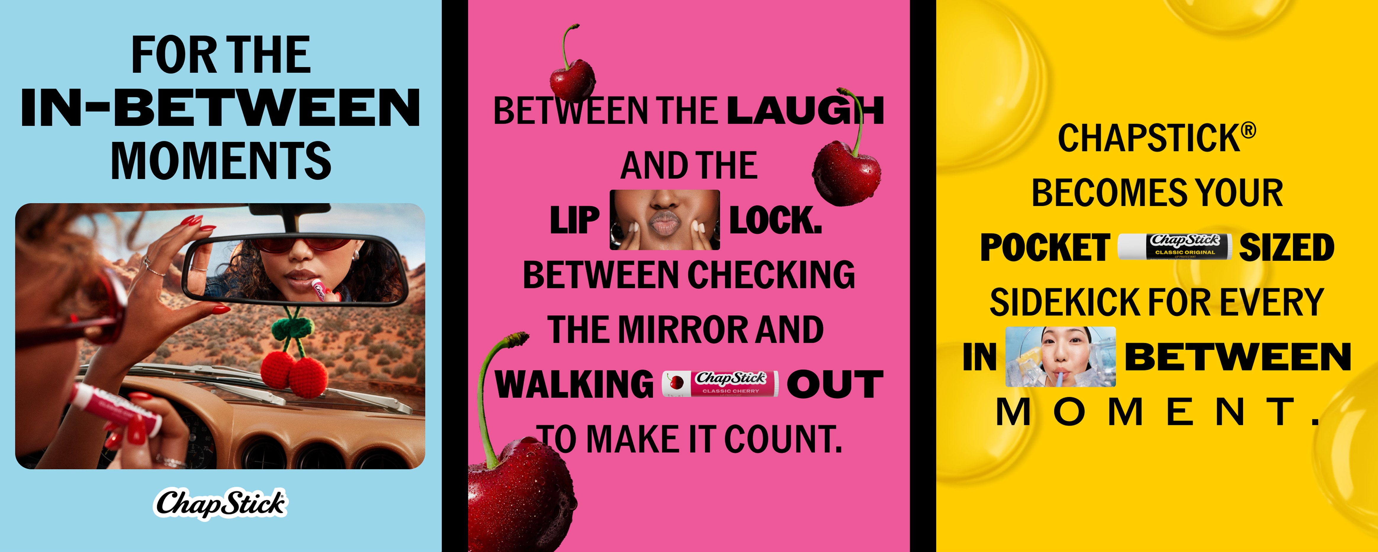
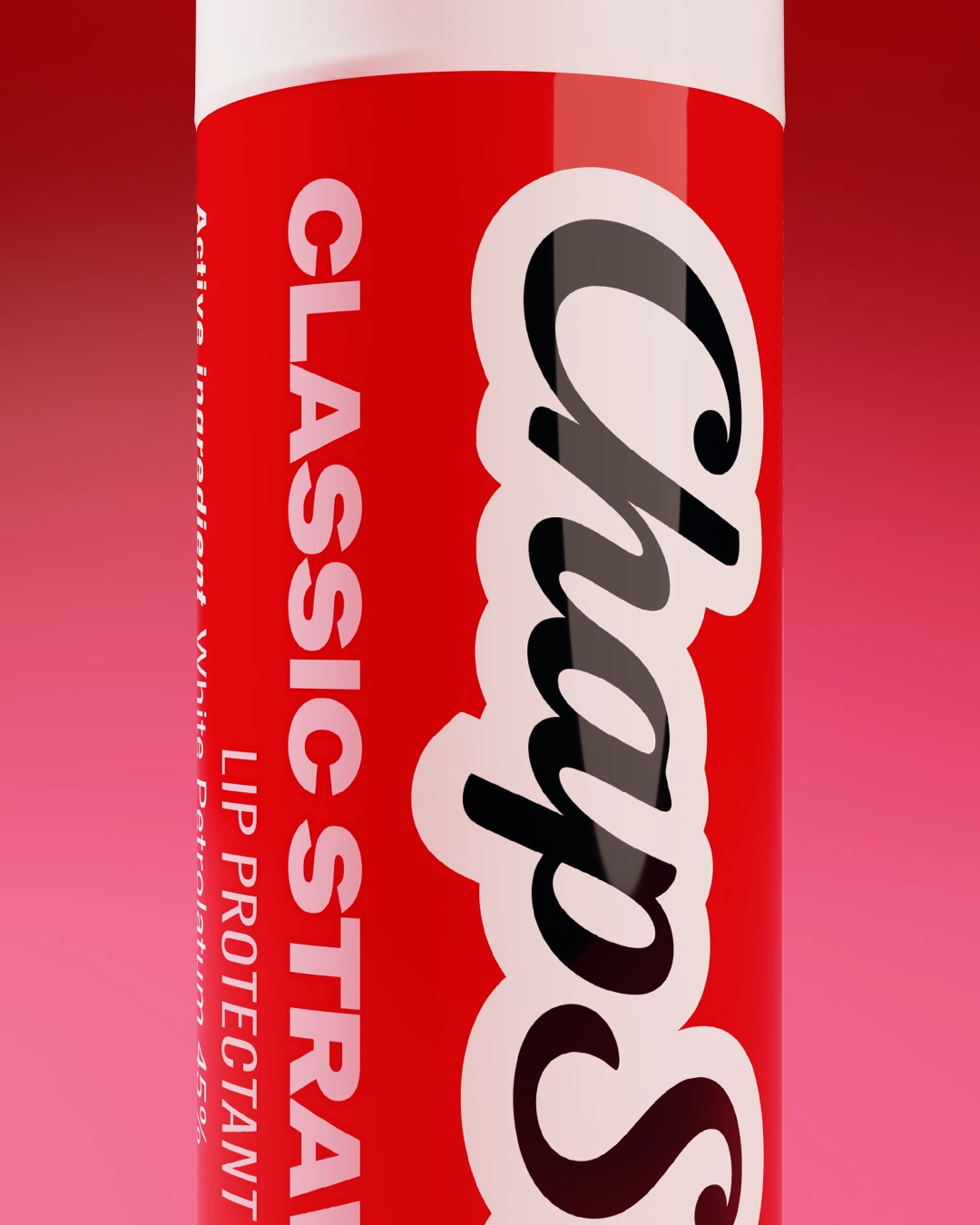
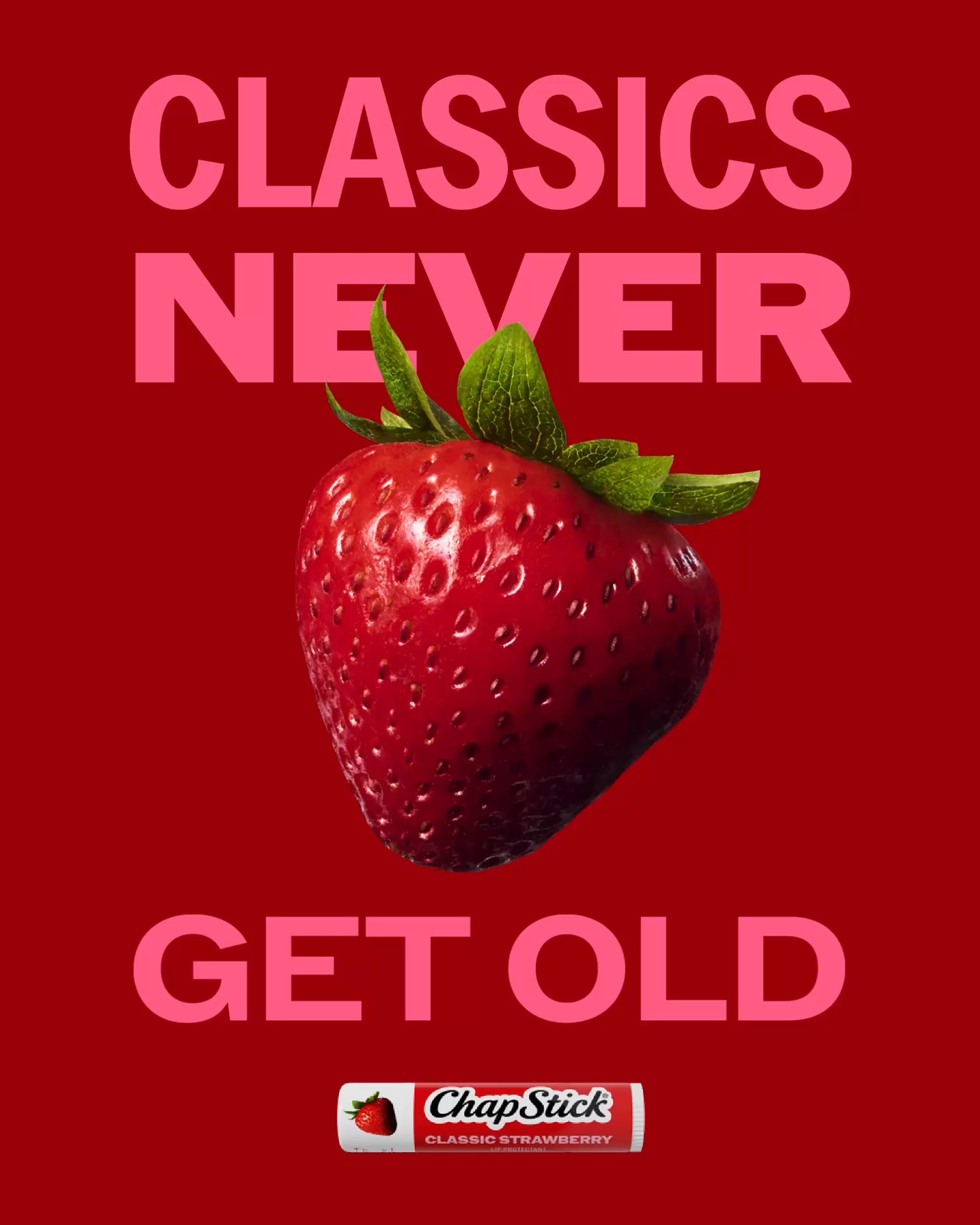
We rebuilt ChapStick from brand world to shelf: visual identity and packaging, POS, influencer mailers and a product-content system across major U.S. retailers. MATTER created the visual world and copy, then stayed inside the machinery, our on-site team orchestrating PDP intake, production, approvals and rollout across formats. Not a campaign handed over at the end, but a working system built to keep the rebrand coherent wherever the product showed up.
The numbers
85 SKUs. 800 tiles for retailer PDPs. 22 major U.S. retailers. One operating system connecting POS, mailers and product pages, run by MATTER from intake through rollout.


Project information
- Visual Rebrand & Product Content System
- Beauty & Personal Care
- 2025–2026
ChapStick
Other projects


Something worth making?
Talk to the people who’ll make it → hello@matter-energy.com